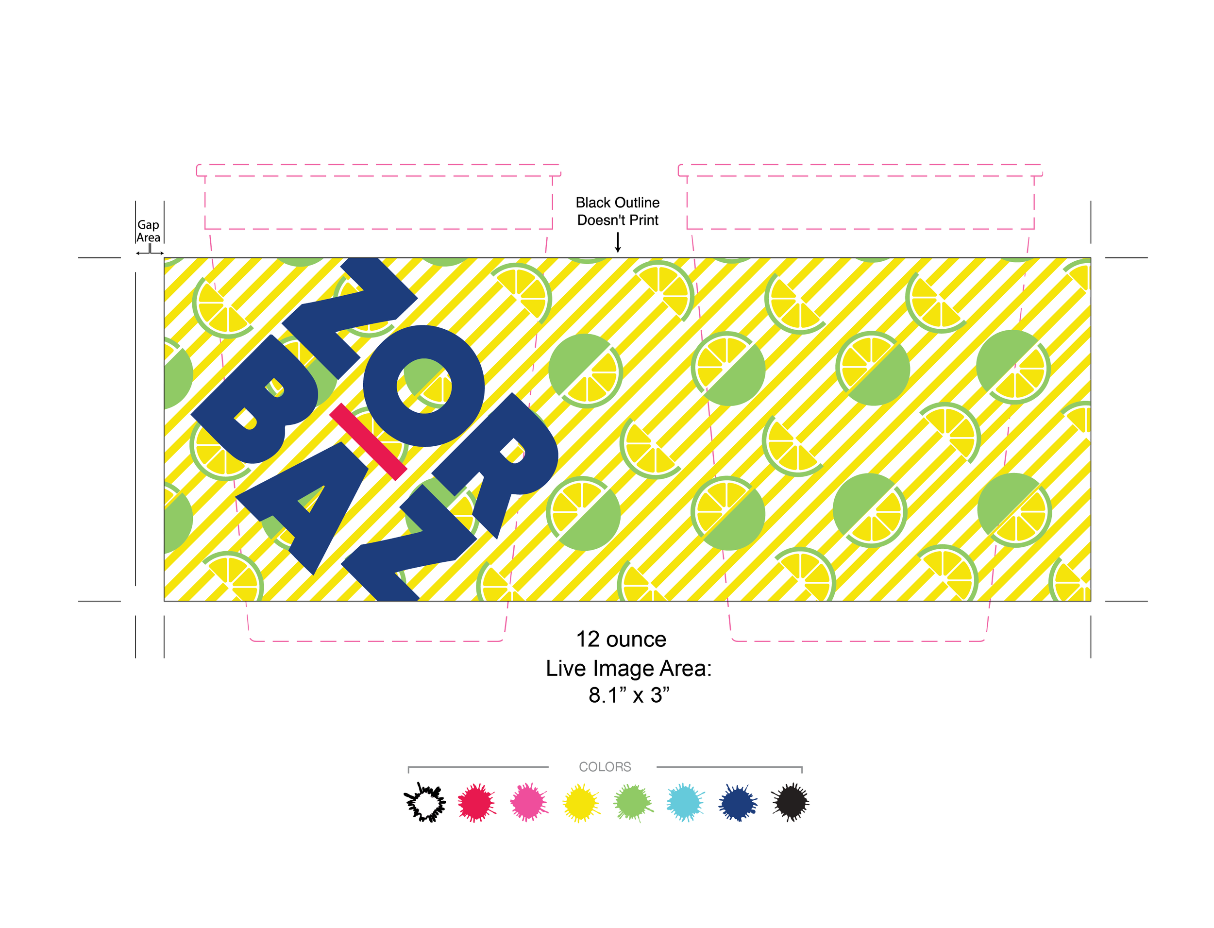
After being on the lakes of Minnesota for fifty years, I worked to help Zorbaz find their new 2020 identity. We moved away from the grungy nineties style they had been associated with, and upgraded them to a modern, clean and bright brand. This included a new logo. The logo played with the pronunciation of Zorbaz, where the ‘a’ tends to be dropped. The accent above that is symbolic of the verbal dip. I wanted it to be flexible and allow for playful elements within the overall brand.
Zorbaz 2020 Rebrand

Stage Skirt Design
Zorbaz is known for their live music. For their stage skirt, I wanted to created an illustration that created energy synonymous with the live music scene. This bright, polygonal style, was a way to bring a new element that could help elevate the newer brand.
A staple in the Northern Minnesotan lake culture
The menu design and the Zorbaz cups always kick off the lake season every year. In the menu, I worked to achieve a bright design that maintained the voice of Zorbaz.
Every local has their own collection of Zorbaz cups (pictured below). They are served with every drink order and work perfectly for the dock access to the restaurants.


Updated screen capture of Zorbaz.com website refresh.
With this design approach, we helped Zorbaz refresh their website to align with the new colors, style and brand identity.
This transitioned to their social pages. Part of the goal was reducing all the properties to one facebook, twitter and instagram page, versus each location having their own page. My job was to help provide any and all collateral needed to maintain the brand across social graphics, event pages and homepage banners/sliders.
As we were launching the redesign, we were faced with COVID-19. This meant we had to shift the messaging to pick-up deliveries, verbalizing which locations offered delivery, and how to make the establishment safe for all their guests when doors re-opened. This meant creating disposable menus, window clings that could display the menus for zero contact and assisting in social media messaging.
Zorbaz 2020 “North of the Cities, South of Free Healthcare” Billboard
Zorbaz 2020 “Order Before, Pick Up in Store”Billboard


